Why Processes Love a Visual Touch
A process is more than a list of steps—it’s the backbone of how things get done. But when you try mapping it out in words, you often lose people halfway through. That’s why turning it into a workflow visualization works so well. An infographic or an isometric diagram transforms boring text into a visual story.You might be mapping out how a product moves through a factory, how customers travel through a service journey, or how a project team shares tasks. When you use visuals, you not only simplify the explanation—you make it stick. People remember images faster than bullet points. Think of it as giving your process a personality instead of keeping it trapped in a spreadsheet.
From Product Flow to Journey Maps
Imagine you’re explaining your product flow: raw materials arrive, production starts, testing happens, shipping follows, and finally, happy customers receive the goods. Now picture that same explanation as a colorful image with icons, arrows, and neatly designed layouts. The difference is striking.A journey map works in a similar way. It’s not just about steps, it’s about experiences. By mapping the journey visually, you see bottlenecks, handovers, and opportunities for improvement. Whether it’s a supply chain or a user experience, visualizing the flow makes it easier to spot what works and what doesn’t.
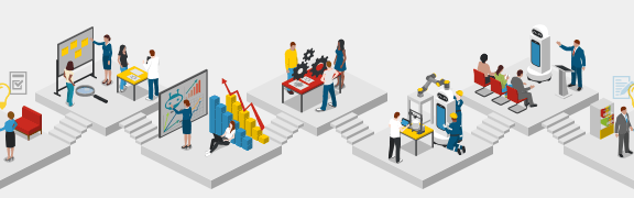
Infographics: Small Art with Big Impact
Think of infographics as the quick storytellers of the process world. They mix words and visuals into one easy-to-grasp picture, so instead of flipping through pages of explanation, you get the idea in seconds.Now, throw in some isometric style and the magic really happens. You suddenly have depth, perspective, and a scene that feels alive without being cluttered. Whether it’s a buzzing factory, a busy office, or even a digital workflow, isometric images make you feel like you’ve stepped right into the process instead of just staring at flat lines and arrows.
Mapping Doesn’t Have to Be Boring
Mapping a process often sounds like paperwork and meetings, but with the right tools it becomes creative. You’re not just documenting—you’re designing. By treating workflow diagrams as art, you bring clarity and creativity together.That’s why journey mapping, workflow design, and product flow infographics are so popular today. They look good, but more importantly, they make sense. A good map lets everyone see the same picture, which is priceless when teams need to align fast.
Your Next Step: Visualize It
The next time you catch yourself writing down a workflow in endless lines of text, stop and ask: could this be a picture? Turn that process into an infographic, map your journey, or try an isometric art style to give it extra dimension.When you transform workflows into visuals, you’re not just explaining—you’re connecting. You’re guiding people through a journey that’s easy to understand, enjoyable to follow, and even inspiring. Because let’s face it, processes aren’t boring when they’re visualized as art—they’re stories waiting to be told.


